
*Probably, but that's just a guess. Facts are for nerds.
The enormous money-generating potential of officially-licensed team paraphernalia means the selection of a team logo takes on a high degree of importance for any franchise. It must not only work to immediately identify the team it's representing, but also be hip, stylish and unique enough to drive the sales of all the already-mentioned child labor-constructed crap it'll be stamped on.
So how do teams go about making this extremely important decision? Well, while some teams hire private design firms, many others make logo-creation a contest open to the public to generate the most ideas possible. That means for every logo selected, hundreds - and sometimes even thousands - of entries don't get a chance to be brandished on an officially licensed jersey, hat, yarmulke or colostomy bag.
In this ongoing series, sharply titled "Rejected Logo Concepts", the DoF will highlight these never-before-seen team logos, so you, the fan, can decide whether or not your favorite franchise made the best decision.
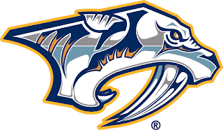
First up, the NHL's Nashville Predators.
Current Logo:
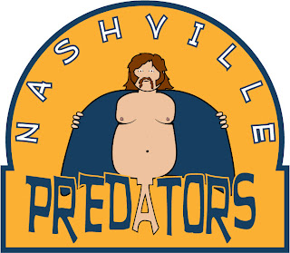
Rejected Runner-Up:
So do YOU think Nashville made the right call? Leave your opinion in the comment section and email diaryoffools@hotmail.com with your contact info/shirt size for a chance to win a T-shirt emblazoned with the runner-up design.


1 comment:
Nice.
Honestly this is a brilliant logo.
Thanks for the comment on my post by the way.
Post a Comment